How to improve your website conversion rate
Plenty of traffic but barely any conversions? Here's how to turn more of your visitors into enquiries and sales, from the non-negotiable basics to the advanced stuff.
Most of what I do at Creative Click comes down to one thing: getting my client's websites to do their job.
That means more visitors doing the thing you built the site for, whether it's subscribing, enquiring, or buying. That "thing" is what we call a conversion.
What does "conversion rate" mean?
Stripped right back, your conversion rate is just the percentage of visitors who do the thing you want them to do.
If you get 1,000 visitors, and 200 of them fill in your contact form, that's a 20% conversion rate. Easy.
To actually track it, you need two numbers: how many people landed on your site, and how many of them converted.
What's a good conversion rate?
Honestly? Almost impossible to answer.
I've got clients over the moon with 5%, and others sitting pretty at 25%. Both are stoked.
It all comes down to your industry, what you're selling, and who you're selling to. Anyone who quotes you a "good" number without being clear on all of those things first is full of shit.
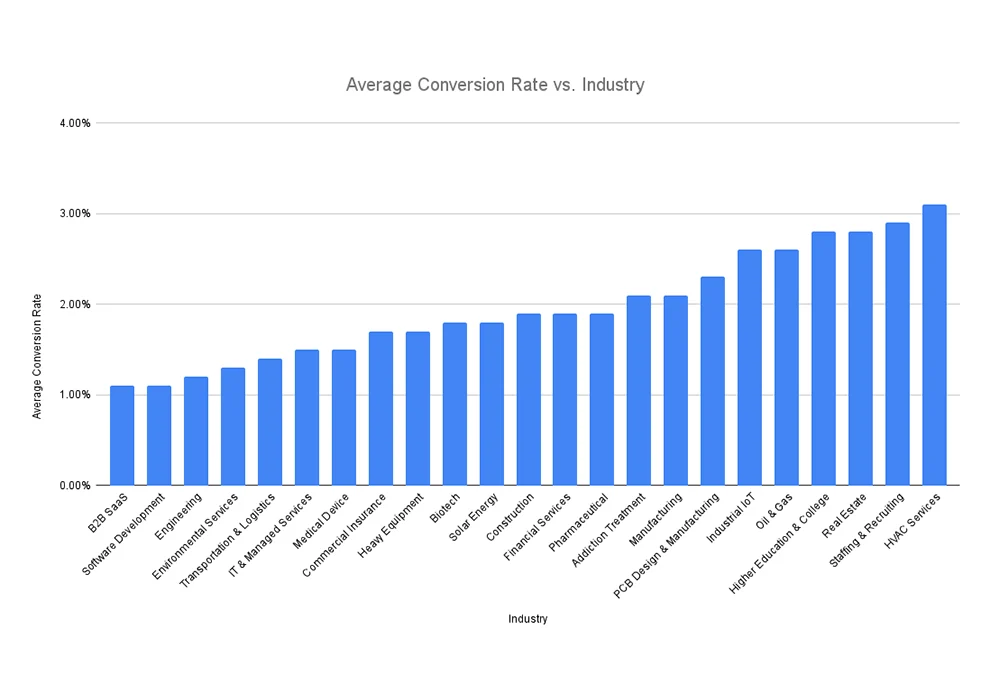
Here's what's being touted as the "average" by industry.
How do I improve my website conversion rate?
There's a long list of things you can do here, and how far down it you go depends on how much traffic you're working with.
Think about this. Say implement something that bumps your conversion rate by 1% (20% to 21%). At 100,000 visitors a month, that's an extra 1,000 conversions. Absolute no-brainer. At 100 visitors a month? That's one extra conversion. Probably not worth losing sleep over.
So the question to ask yourself is how much traffic do I get, and what's a single conversion actually worth?
That'll tell you if how much any specific tactic is going to be worth.
Basic Conversion Rate Improvement Tasks
Doesn't matter if you're getting 100 visitors or 100,000, these are the non-negotiables for a site that converts.
Have a clear value proposition
The second someone lands on your site, they need to know how you help them. What you do, and why it matters to them. Don't make them work for it.
On average, 8 out of 10 people will read your headline, but only 2 out of 10 will read the rest.
Your headlines are doing 80% of the heavy lifting, so they need to nail it. Make it dead clear what your customer gets, what problem you solve, and why you're not just another version of your competitor. Without needing them to read every word of copy on your site.
And don't tell me you're "high quality" or that you "really care about your customers." Everyone says that. It's the same hollow crap every one of your competitors is spouting, and your customers have heard it a thousand times. It means nothing because no one is arguing the opposite.
Want to know what actually makes you different? Go ask your customers what they love about working with you. Wild idea, I know.
Be relevant to your audience
One thing I see constantly: site content that just isn't relevant to the people reading it. Either it's so generic it could belong to anyone, or it's pitched at completely the wrong crowd.
Stiff, "boring" corporate language might fly on a high-end law firm's site. Drop that same tone on a tech startup chasing a younger audience and it's gonna bomb.
If you land on a website and the content clearly isn't for you. What do you do? You leave. You go find something that actually speaks to you.
So why would your potential customers be any different?
If you want your site to convert, the content has to feel like it was written for the exact person reading it.
Make sure you are visually appealing for your target audience (not you, your friends, or your family)
Yes, your website should fit your brand and your personality. But here's the bit people forget: it has to appeal to your audience, not just you.
So many business owners fall into the trap of building a site they personally love, without stopping to ask whether their audience will love it too.
Now, if you happen to be the exact same demographic as your customers, your taste might line up. Maybe. But don't bet on it.
There's actual science behind this stuff. There's a stack of data on how design choices land with different demographics, age, location, income, education, all of it. Factor that into your creative design brief, make sure your designer is working to it, and you're already ahead of most people.
Because design isn't just "art" and "being creative." Data and psychology do just as much of the heavy lifting.
Remove any distractions on the way to conversion
My mate Adam Lacey over at Split Hero told me: "Distractions are deadly for conversions."
If you want someone to take a specific action, the worst thing you can do is hand them a pile of other things to do instead.
Every distraction is another chance for them to wander off. And the more chances you give them to leave, the more of them will.
So go through your page and strip out anything that doesn't help that visitor convert. Be ruthless. Keep it locked on the one thing you want them to do.
Add social proof
Nobody takes action on a site they don't trust. Simple as that.
And the bigger the ask, the more trust you've got to earn first. Handing over an email is easy. Handing over a few grand? That takes some convincing.
This is where social proof earns its keep — anything on the page that proves you're the real deal and that people have backed you before.
Testimonials. Reviews. Trust badges. Client logos. The lot.

If it signals "this business is legit," get it on the page.
Make next steps easy
Want someone to take action? Then make it stupidly easy for them.
Picture browsing a site, deciding you want to buy something... but you can't find a single button to actually do it. If you're really keen you might hunt around for a bit. Most people will just leave.
Or the other classic: you're ready to grab something, and then you're hit with a giant form demanding your life story before you can have it. Hard pass.
The golden rule is to make taking action effortless. That means:
- Make your call-to-action stand out and impossible to miss.
- Cut every unnecessary step and form field.
- Use language that's clear, short and compelling.
Advanced Conversion Rate Improvement Tasks
Once you've got real traffic flowing, even tiny conversion bumps start adding up to serious money. That's when it pays to roll up your sleeves and get into the advanced stuff.
Traffic Analysis
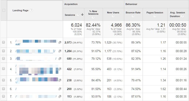
Dig into your analytics and you can see exactly where people enter, which pages pull the traffic, which ones convert, and where people bail.
And that's barely scratching the surface.
Your analytics are full of data, just sitting there waiting to tell you where to focus.
Say your About page is one of the most-visited pages on the whole site but doesn't convert anyone. That's telling you exactly where to put your attention next.
Heat Mapping
Heat mapping software lets you actually watch what people do on your site.
It's kinda creepy to watch. You see real visitors doing real things. Where they scroll, what they click, what they completely ignore.
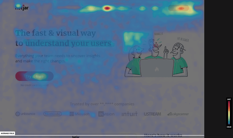
But when you can see that stuff, you can see what's costing you leads and fix it.
Split Testing
Here's something that surprises some people: your content moves the needle on conversions even more than your design does. Design's job is to get people to actually see and read the content, but amazing design presenting shitty content is like putting lipstick on a pig.
The words you use, and the message behind them, are the difference between a visitor converting and a visitor bouncing while your conversion rate quietly tanks.
So as part of an ongoing conversion strategy, we lean on split testing software to test variations of headings, paragraphs, images, form fields, sometimes right down to the wording on a single button.
The way it works is you have version A (usually the original) and version B (the tweaked version). The software splits your traffic between the two, then tells you which one converts better. The winner takes the crown and becomes the new page. Then you do it all again.
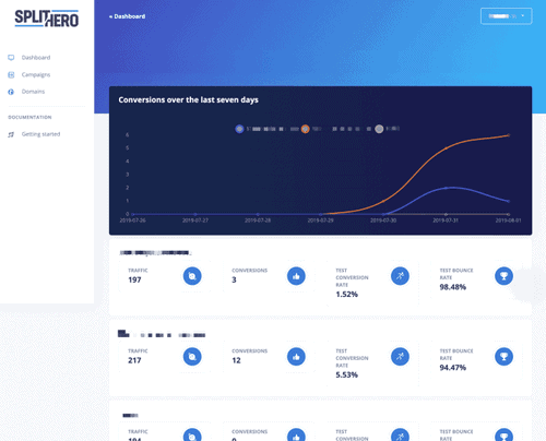
You can even split test entire layouts, which is handy when you want to know whether adding more content to a page actually helps, or just gets in the way.
What next?
Getting serious about your conversion rate can completely change what your website does for your business. If your site's currently doing sweet FA, this is how you turn that around.
And if it's already pulling in results but you know there's more it could be doing? That's exactly the kind of thing I love to look at. Let's talk about your conversion strategy.